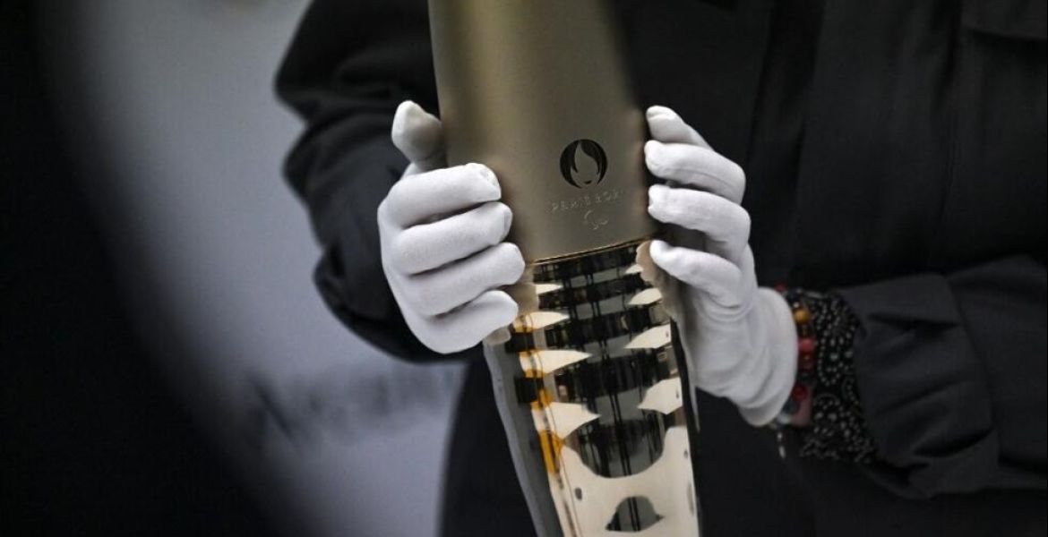
The logo is also known as the Agitos, originating from Latin to mean 'I move'.
The original logo of the Paralympic Games incorporated Tae-Geuk, a Sino-Korean term meaning 'supreme ultimate' which features in the centre of the South Korean flag and has been popularised in the West as Yin and Yang.

The logo made its debut at the historic 1988 Paralympic Games in Seoul, Korea. It was the first time the term 'Paralympic' was used officially, as well as the first time in 24 years that the Paralympics took place in the same city as the Olympic Games, a precedent that has been followed ever since.
The original logo contained five colours replicating the style of the Olympic rings and was used until the 1994 Paralympic Winter Games in Lillehammer, Norway.
After just six years, the Paralympic logo was updated for the first time, with the desire to create more differentiation from the Olympic symbol. The design was launched at the 1994 World Para Athletics Championships in Berlin, Germany.

The logo kept the design of the Tae-Geuks, but included only three of them coloured red, blue and green, the most widely represented colours in national flags across the world.
After a review of the previous logo, the International Paralympic Commission (IPC) commissioned the logo to be modernised in 2003, which launched alongside the new motto; Mind, Body, Spirit.

At the closing ceremony of the Athens 2004 Paralympic Games, a new flag was handed over to Beijing for the next edition of the games, with the new symbol on it.
The logo retained the same colours, however the symbols were lengthened and morphed together into a circular style.
The text 'IPC' was incorporated for the first time and was launched with a new motto; Spirit in Motion.
Finally, in 2019 the IPC wanted to future-proof their logo for the digital age and strengthen its appearance.
The three individual elements were made the same size as each other, and now rotated around a shared central point.

The IPC also adopted a new brand narrative; Change Starts with Sport, supporting their desire to change attitudes and create more opportunities for people with disabilities.